BigPay International Transfers
BigPay is a Southeast Asian digital money app with a payment card. People can spend, track and send money from an app on their mobile phone. In 2019, it launched its international money transfer service. This is how I designed and delivered the service.


Opportunity
Expanding beyond its core offerings
BigPay started as a popular money app in Malaysia, known for its prepaid card that works anywhere Mastercard is accepted. The main advantage was that it charged no foreign exchange (FX) fees when you pay in the local currency, making it a go-to for travellers. The app also help users track their spending with easy-to-understand insights and makes sending money to other BigPay users as simple as tapping a button.
Over time, it also attracted a large following amount the expatriate and migrant workers too. Insights from our initial surveys highlighted a growing demand for an international transfer service, particularly for sending money to home countries.
I led the research and design for this service with the goal of making international money transfers as easy and seamless as sending money locally.
Problem
Senders are inconvenienced by the amount of effort needed to set up a transfer
To understand what's wrong, I analysed six competitors in Malaysia and abroad as well as held workshops with ten participants to map their journey when sending money abroad. This research revealed several key issues:
Too many steps to see cost and exchange rate: Most services require users to enter recipient details before showing the cost and exchange rate, making the process unnecessarily complicated.
Information overload: Users are overwhelmed with too much unnecessary information, making the interface cluttered and confusing.
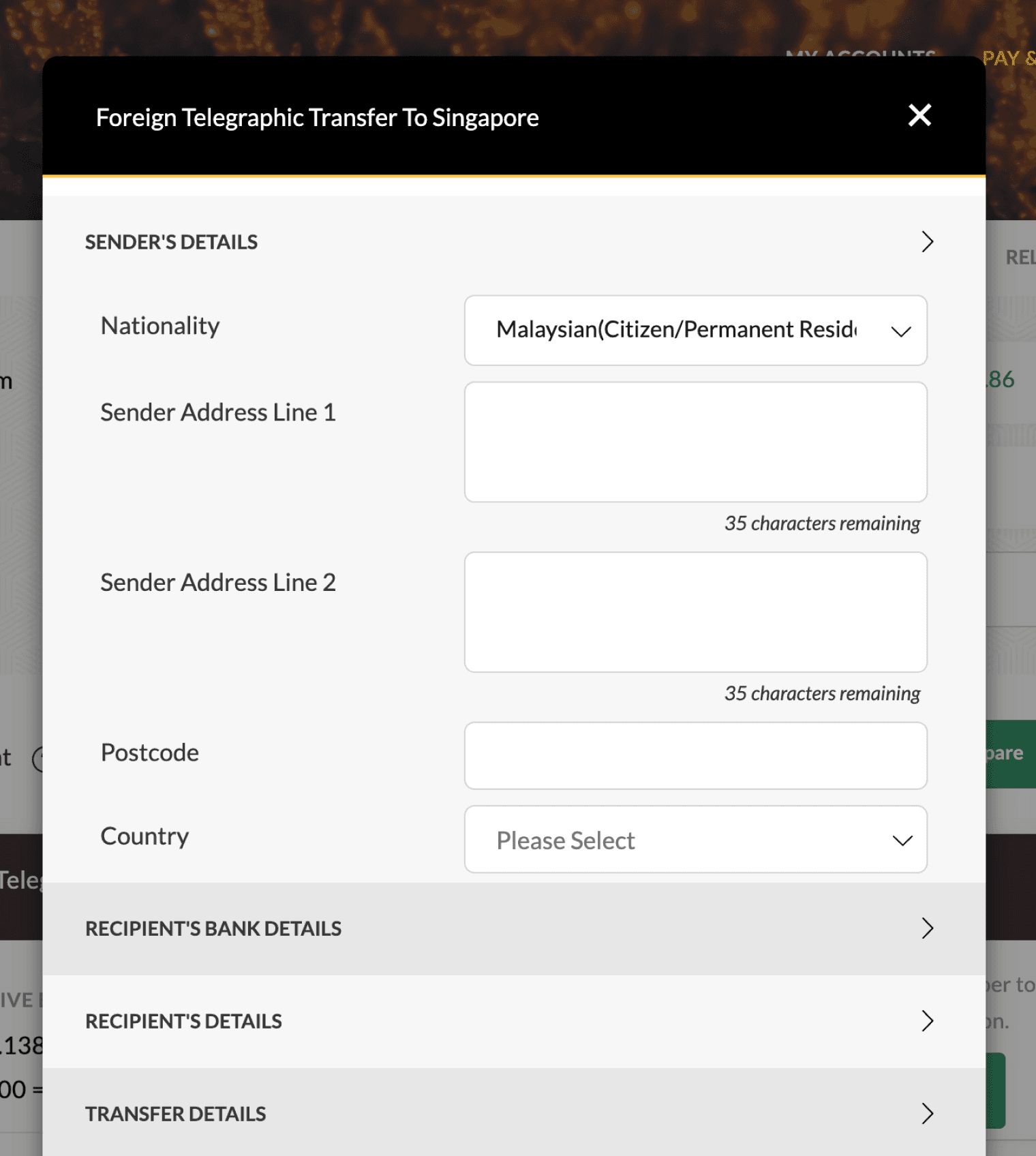
Lengthy form filling: Many forms ask for unnecessary details, even from existing customers, leading to frustration and delays.
Poor post-payment experience: A lack of communication and support after the transfer can be very stressful for users.

Too much information
Unnecessary information was being surfaced all at once making it difficult for users to focus on the information that matter
Unnecessarily lengthy forms
Why make users fill their own personal details everytime they make a transfer when the bank should already have this information?

Complex copy
Dropdown options for Purpose and Sub Purpose were confusing and difficult for people to understand, making the form unnecessarily complicated
Screenshots of competitor transfer journey
Discovery
Understanding the sender's journey
I carried out research to create a clear journey map of the senders’ experience. This involved one-to-one sessions with five individuals. Each person used the money transfer service on their own device—mainly their phones—and walked us through the steps they normally take, explaining their actions and decisions along the way. They didn’t share personal or sensitive details, like account numbers or amounts, which kept everything secure.
To protect privacy, we asked participants to describe what they were doing rather than showing specific information. For example, someone might say, “Here, I choose the recipient from my list,” and talk us through the fields they used. This allowed us to fully understand how they worked through the process while keeping their data private.
The insights from these sessions were combined into a journey map, showing key stages like ‘Explore’ and ‘Set Up,’ where people faced the biggest challenges. This map guided us through development, helping us focus on the most important problems to solve and improving the overall experience.
STAGE
GOAL
ACTIVITIES
PAIN POINTS
Trigger
If they are switching provider: decide if they it’s worth switching
Receives a reminder to make a regular scheduled transfer
Receives a request to send money
Found out that rates are favourable to transfer
Bad exp with the last provider so looking for a new one
Annoyed that they had not transfer when rate was better
Explore
Find the best transfer deal
Compare fees
Compare exchange rates
Compare transfer times
Compare reviews / past experiences
Confusing fee structure makes it difficult to compare
Too many steps just to view fees and amount
Information overload
Decide
Confident that they’ve picked the right provider
Decide if they want to go ahead with their choice
Decide if they can trust the provider
Decide if they it’s worth switching
Set up
Quick and easy set up
Verify identity (new customer)
Enter recipient details
Review transfer details
Pay
Unnecessarily lengthy forms
Jargon-filled language
Transfer only available at working hours e.g. 9am - 6pm
Delivery
Recipient receives the money quickly
Tell recipient and share delivery details
Check with recipient if the transfer has arrived
Get help when needed
Lack of status updates
Vague delivery times
Difficult to access help
Ideation
Sharpening our focus
To address the issues identified during research, we brainstormed several "How Might We" statements, narrowing them down to the top three through collaboration. By working with the Lead Developer, we assessed feasibility and complexity, prioritising solutions that were low-effort but high-impact.
We adopted a three-phase approach to tackle these problems effectively. Phase one focused on quick wins—implementing simple yet impactful changes. For example, the Product Manager suggested adding detailed status tracking for transfers. While valuable, I proposed a more immediate solution: prominently display the estimated transfer arrival time and make relevant help articles easily accessible. This addressed user concerns with minimal development effort.
Phase two involved testing the impact of these improvements, using metrics like user satisfaction and support ticket volume to gauge their effectiveness. Based on these results, phase three would revisit more complex solutions, such as detailed status tracking, if the need was validated.
This phased strategy allowed us to make meaningful progress while staying agile and managing the project scope effectively.
HMW show key transfer information so senders feel confident in choosing us?
Show cost and transfer times upfront
Clear fees and show ETAs, not a delivery time range
Use layman language
Present information that's easy for people to understand
HMW make it easier for senders to set up their transfer?
Simplify forms and only ask what's required
Save recipient information
Explain transfer terms and provide tool tips
HMW give senders a peace of mind after paying for their transfer?
Users can easily find transfer information e.g. arrival times
Create support content and make it easy to find
Status updates and notifications
Embed contextual support in the transfer flow
Validation
Striking the balance between simplicity and complexity
Finding the right balance between providing enough information and avoiding user overwhelm is a delicate challenge. To address this, I explored hundreds of design iterations for the key transfer screen and narrowed them down to three distinct options for testing. Using UserTesting.com, I conducted usability tests with eight participants to uncover pain points and preferences.
Key learnings:
Visibility of key actions - Five out of eight participants found the option to enter the amount in MYR unclear.
Users needed clearer visual cues to guide them through key actions, such as selecting currencies or entering amounts.
Prominence of transfer arrival time - Two participants mentioned that the transfer arrival time was not prominent enough.
Critical information like transfer timing needs to stand out to reassure users during the decision-making process.
Understanding fees and rates - Three participants struggled with the presentation of fees and rates. Two mistakenly believed the (-) and (X) icons were interactive.
Visual elements need to be carefully considered to avoid misinterpretation, and fee explanations should be simplified further.
Clarity around transfer fees - Participants were split on whether the transfer fee should be included in or added to the send amount. Some also found the "You Send" vs. "You Pay" labels in MYR confusing.
Fee presentation and terminology need refinement to ensure they are intuitive and reduce cognitive load.
Solution
A convenient, mobile-first transfer journey
This is what we delivered for our first release.
Chester Vaughn
4363 1234 5678 9101
11/20
expiration

JomPay
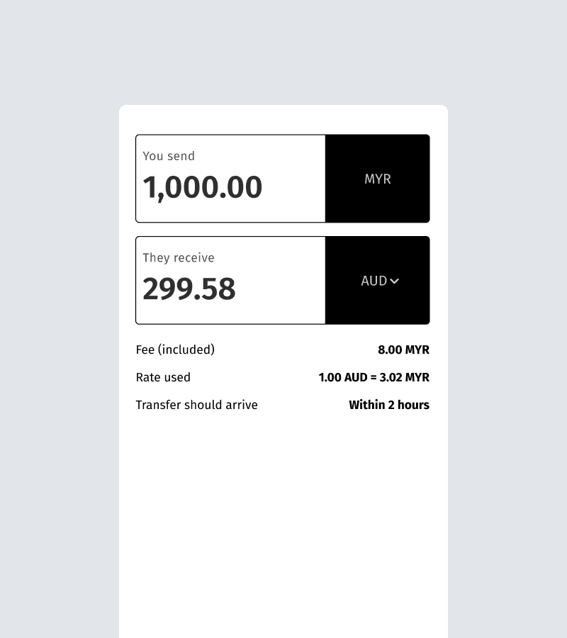
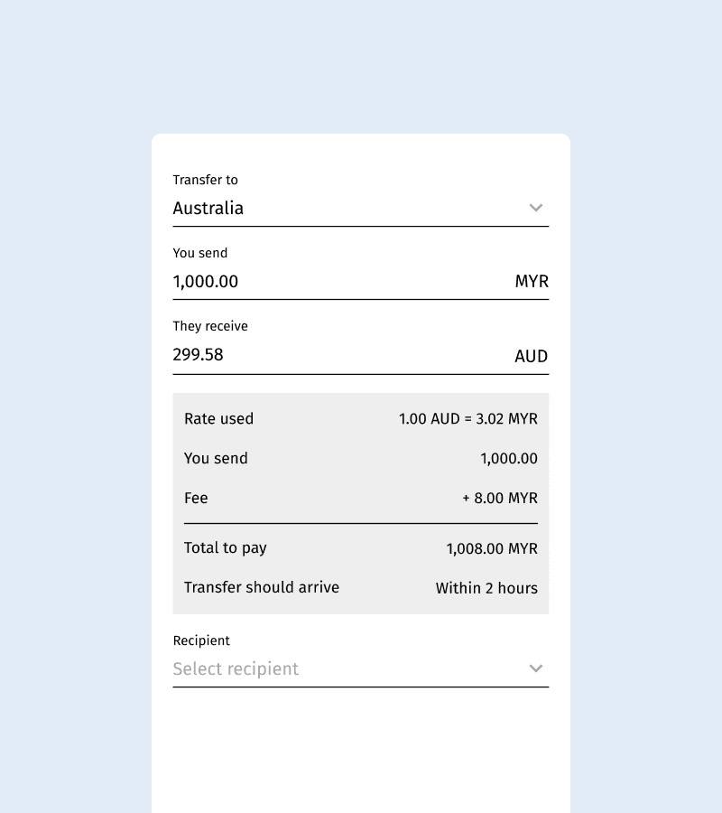
MYR
1,000.00
You send

302.00
They receive
AUD
Fee (included)
8.00 MYR
Rate used
1 MYR = 0.302 AUD
Transfer should arrive
Within 2 hours
All-in-one information and currency flexibility
When transferring money, clarity is everything. That's why we show all the key information—fees, rates, and arrival times—right from the start. Plus, you can enter amounts in both local and foreign currencies, making it easier to send the exact amount needed.
Transfer details
Cara Wong
Full name (exactly as per ID)
Australian Bank
55012345678
Account number
Savings
Transfer purpose
Save recipient
Bank name
Streamlined forms
Nobody likes filling out long, tedious forms. So, we only ask the bare minimum. We also auto-suggests bank names as you type, speeding up the process. We also help reduce errors by providing clear tips.

Bank transfer to
Cara Wong
Total paid
1,000.00 MYR

Share receipt
Easy proof of payment sharing
Users can conveniently share proof of payment and estimated transfer times with recipients, ensuring everyone stays informed and reassured throughout the transaction.
Result
We achieved 150% of our revenue goal within the first three months
We launched the feature in September 2019, supporting four currencies, and quickly saw impressive results. We achieved 150% of our revenue goal within the first three months and saw an 11% increase in retention among users who utilised the International Transfer feature.
To decide which currencies to support next, we added an 'Other' option in the country/currency selection in the subsequent release, allowing users to make suggestions.

Mw1960
App Store review
"…the exchange rates are so good it’s better than going to any money exchange. The time to do the transfer is so fast & easy, so much better than using banks."

DDR
Playstore review
"Easy to use, cheap and fast international transfer"

AmanoSenpai
Playstore review
"…It took very little time to transfer to another country. Currently I have already transferred to Indonesia and Philippines. The transfer took only around 5-10 minutes."